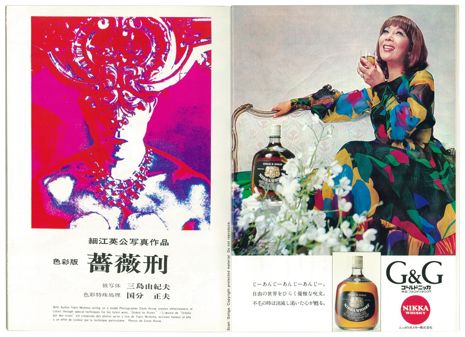
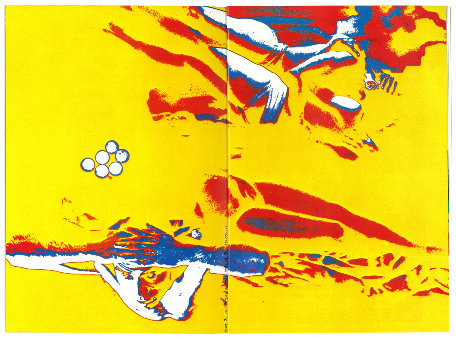
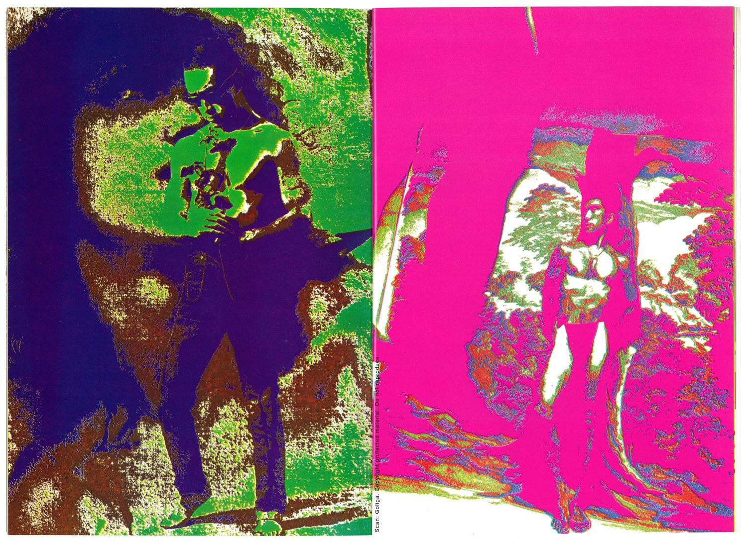
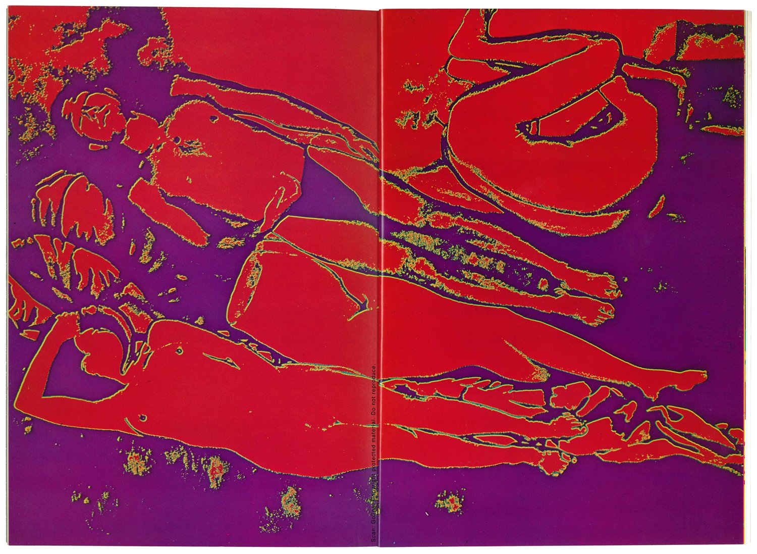
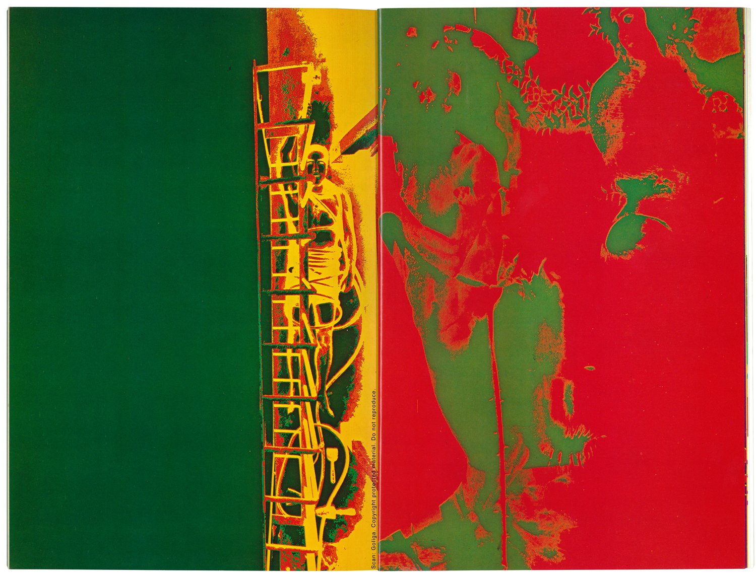
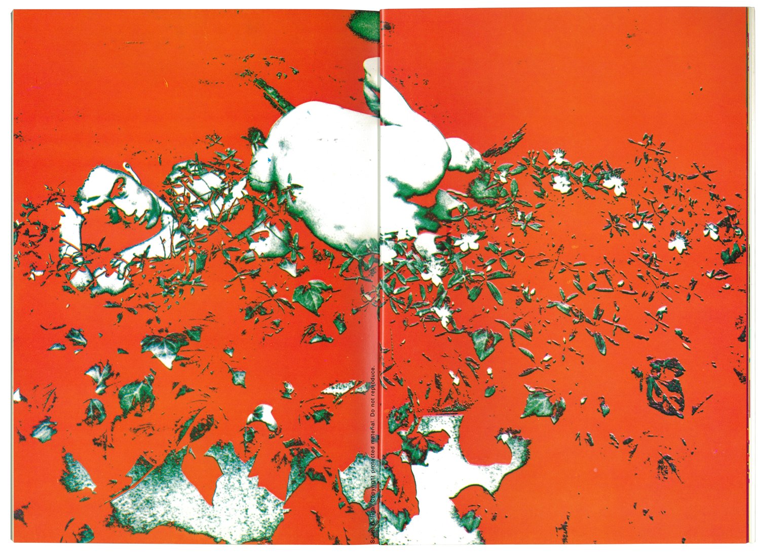
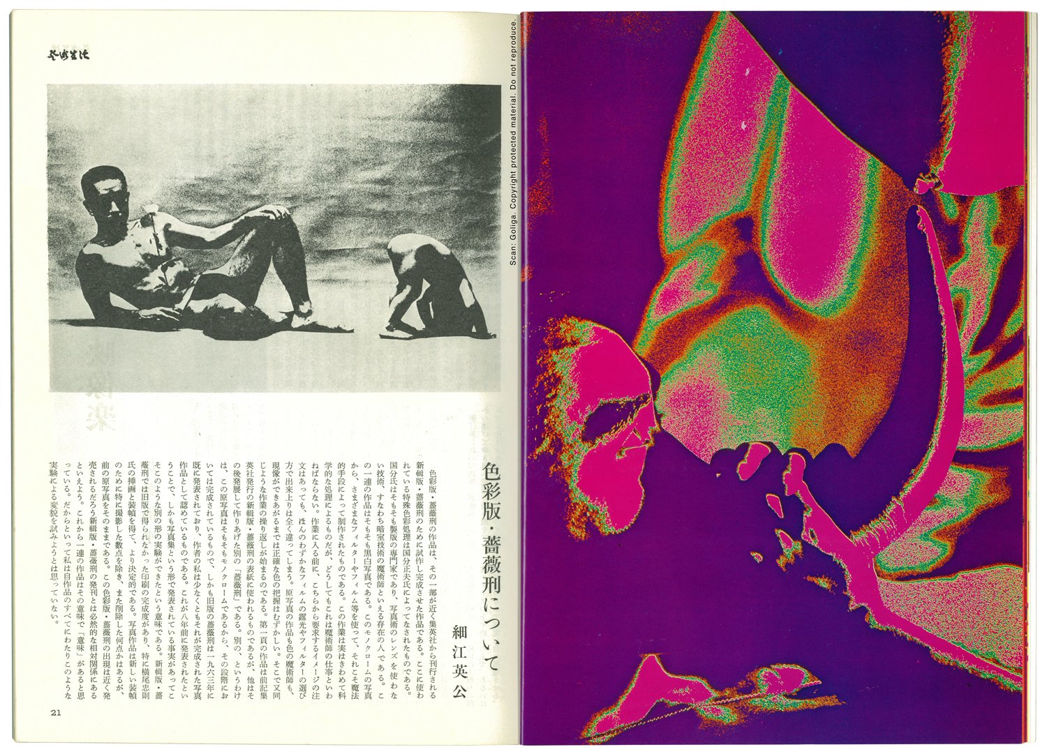
Magazines were once the first and most immediate way for publishers to share news of new photography publications. In some cases, these promotional articles developed into editorial or artistic productions in their own right. In 1971, in the lead-up to a new version of Hosoe Eikoh’s legendary photobook Barakei (Ordeal by Roses) nine reimaginings of Hosoe’s photographs of Mishima Yukio appeared in an issue of art magazine The Geijutsu Seikatsu. These images became a separate, magazine-only version of the book.
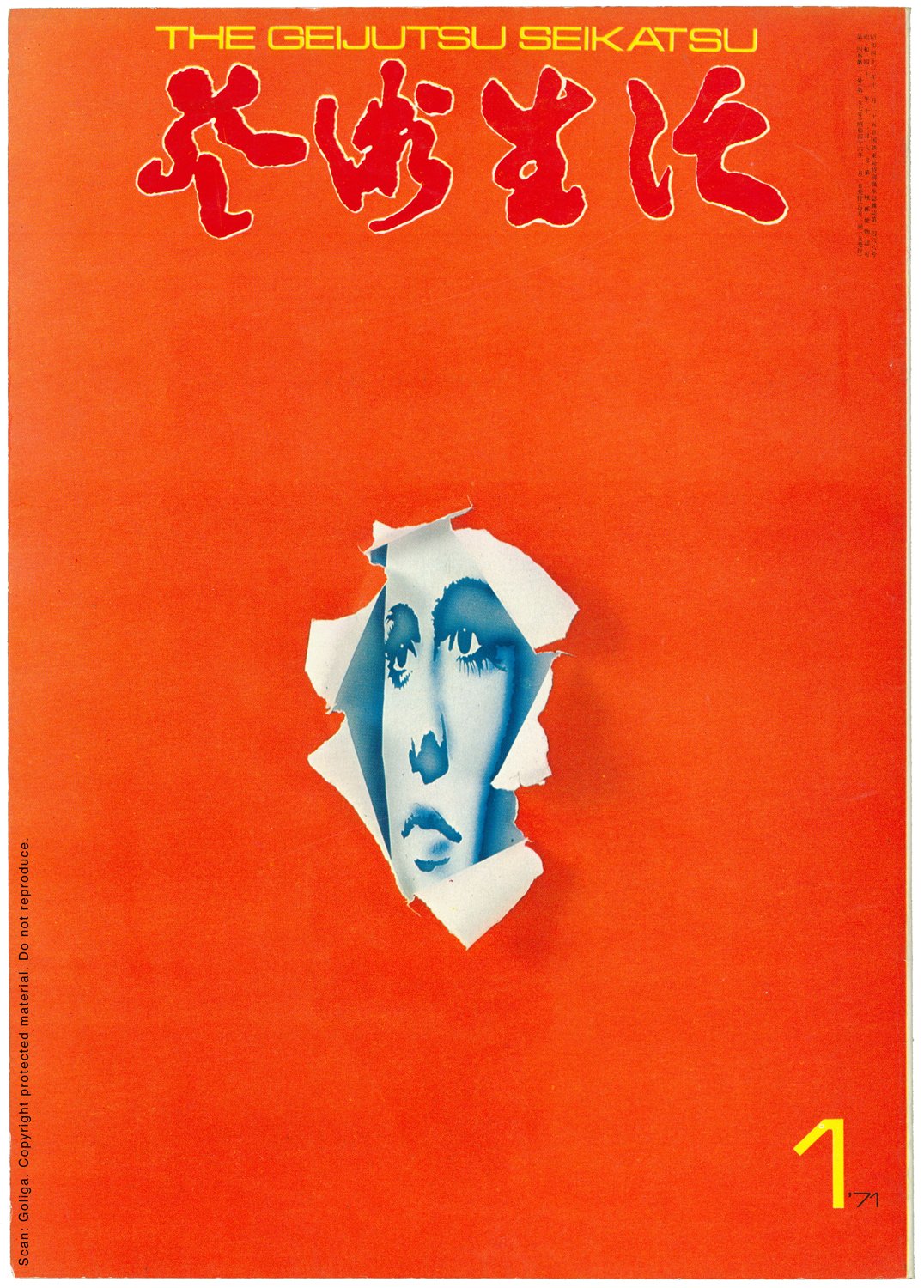
芸術生活
1971年1月号
芸術生活社
オフセット印刷
pp. 9–21
The Geijutsu Seikatsu
January 1971
Geijutsu Seikatsu-sha, Tokyo
Offset printing
pp. 9–21
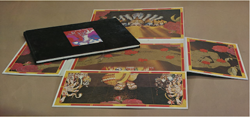
Hosoe Eikoh’s legendary photobook Barakei (薔薇刑, Ordeal by Roses) was first published in 1963 by Shūeisha, Tokyo. Eight years later, in 1971, Shūeisha published a remastered version of the book with a new format and improved printing. The deluxe box that housed the new edition was designed by Yokoo Tadanori, who shared a close artistic and personal connection with the subject of Hosoe’s photography, novelist Mishima Yukio. Spread lengthwise across the interior of the box is a line drawing by Yokoo based on one of the images in the book. The figure’s form is colored with a metallic ink, which has no tonal gradient. Already at this time, Yokoo was a master of manipulating offset printing and using an inordinate number of printing plates to create his posters. The interplay and choice of color in this design represents Yokoo working at the height of his powers. Tipped into an embossed area on the front cover of the book’s case is another colored version of Hosoe’s photography, an image that was generated by printing plate specialist Kokubun Masao. Different in approach from Yokoo’s technique, Kokubun’s reworking of Hosoe’s black-and-white photograph is given color as a part of the offset printing plate-making separation process. While the process is highly technical, Hosoe refers to it as “magic,” underscoring the marvel of Kokubun’s work to create color value where there was once none. Alchemy may have been a more apt choice of words but the creation of something from nothing does extend the larger themes within the photography proper, an impulse that can also be seen in the gods of Indian religion that hover over Mishima’s outstretched form in Yokoo’s box design. The 1971 edition of Barakei features only one colored image created by Kokubun. However, a set of nine of these color versions were reproduced in the January issue of The Geijutsu Seikatsu. In the accompanying text, Hosoe recognizes the reproduction of the colored images as yet another version of the original work and titled the set Shikisai-ban Barakei, meaning Color Version Barakei. This would not be the last time that the photographer would revisit and reconfigure the same body of work but this feature in The Geijutsu Seikatsu would be the only instance where this color version of Hosoe’s iconic images would appear in print or any other format. In the 1970s, Kokubun’s work in colorizing photography was of popular appeal and his images were used on various book covers of the time. —I.V.
The 1971 edition of Barakei, designed by Yokoo Tadanori. Image: Nippon.com
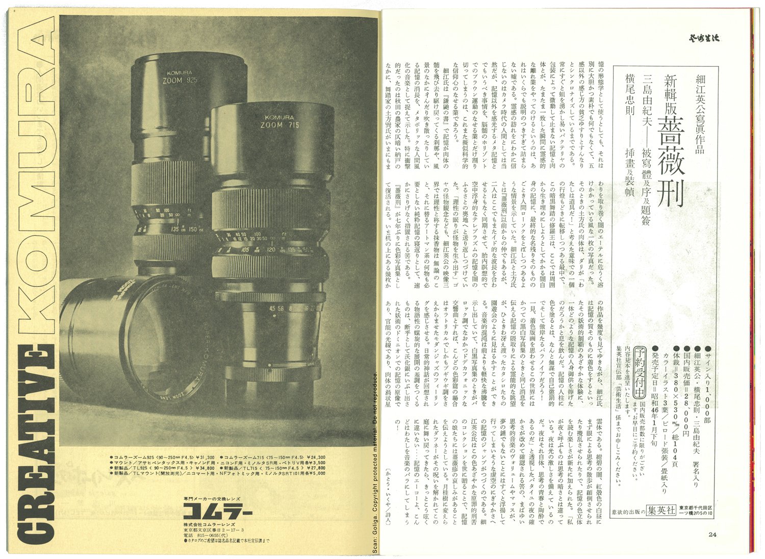
Following is a transcript of Hosoe’s text, which appears on page 21 of the same issue.
Original Japanese text follows the English translation.
About Color Version Barakei
by Hosoe Eikoh
One part of the Shikisai-ban Barakei (色彩版・蕎薮刑, Color Version Barakei) was made as a test piece for the publication of the redesigned edition of Shinshu-ban Barakei (新輯版・薔薇刑, New Version Barakei) to be published by Shūeisha. The special color processing that is used here was carried out by Kokubun Masao. He is originally a printing plate specialist, employing a technique that doesn’t use lenses of photographic practice, in other words, he is a magician of darkroom practice. This set of images was originally black-and-white. From these monochromatic photographs, using various filters and films, indeed magic ways, he generated these images. Even though this work involves a high-grade scientific processing, it must be called the work of a magician. Before commencing work, even though I made requests for a certain type of image to be generated, with just the smallest amount of film exposure and choice of filter, a totally different image resulted. For both the maker of the original image as well as for the magician of color, it is difficult to accurately grasp the color until the image has developed. Then a repeat of the same kind of work begins. The work on the first page will be used on the aforementioned new design Barakei published by Shūeisha but the others that were formulated thereafter are a different “Barakei”. What I mean by different is the original photographs are monochromatic so at that point they were complete in form; moreover, the old edition of Barakei was released in 1963 so, at the very least, as the creator of this work I recognize those photographs as their completed state. That was released eight years ago and the fact that the work was released in a photobook format makes these images a different experimental creation. This New Edition Barakei has a level of printing that wasn’t achieved in the old edition and, in particular, with the illustrations and external design by Yokoo Tadanori, it is all the more the definitive version. Apart from the images that were specially shot for the new exterior design and the removal of a few images, the original photographs that appeared in the prior edition are intact. The appearance of this Color Version Barakei is inextricably related to the imminent publication of the New Version Barakei. In this sense, this series of work has meaning. That said, I do not intend to attempt this kind of experimental transformation in all of my work.
色彩版・薔薇刑に ついて
細江英公
色彩版・蕎薮刑の作品は、その一部が近く集英社から刊行される新輯版・薔薇刑のために試作し完成させた作品である。ここに使わ れている特殊色彩処理は国分正夫氏によってなされたものである。国分氏はそもそも製版の専門家であり、写真術のレンズを使わな い技術、すなわち暗室技術の魔術師といえる存在の人である。この一連の作品はそもそも黒白写真である。このモノクロームの写真 から、さまざまなフィルターやフィルム等を使って、それこそ魔法 的手段によって制作されたものである。この作業は実はきわめて科学的な処理によるものだが、どうしてもこれは魔術師の仕事といわ ねばならない。作業に入る前に、こちらから要求するイメージの注 文はあっても、ほんのわずかなフィルムの露光やフィルターの選び 方で出来上りは全く違ってしまう。原写真の作品も色の魔術師も、 現像ができあがるまでは正確な色の把握はむずかしい。そこで又同 じような作業の操り返しが始まるのである。第一頁の作品は前記集 英社発行の新輯版・薔薇刑の表紙に使われるものであるが、他はそ の後発展して作りあげた別の「薔薇刑」である。別の、というわけ は、この原写真はそもそもモノクロームであるから、その段階にお いては完成されているもので、しかも旧版の薔薇刑は一九六三年に 既に発表されており、作者の私は少なくともそれが完成された写真 作品として認めているものである。これが八年前に発表されたということで、しかも写真集という形で発表されている事実があってこそこのような別の形の実験ができたという意味である。新輯版・薔薇刑では旧版で得られなかった印刷の完成度があり、特に横尾忠則 氏の挿画と装幀を得て、より決定的である。写真作品は新しい装幀 のために特に撮影した数点を除き、また削除した何点かはあるが、 前の原写真をそのままである。この色彩版・薔薇刑の出現は近く発 売されるだろう新輯版・薔薇刑の発刊とは必然的な相対関係にあるといえよう。これから一連の作品はその意味で「意味」があると思 っている。だからといって私は自作品のすべてにわたりこのような 実験による変貌を試みようとは思っていない。
*Translations from Japanese to English are by Ivan Vartanian
